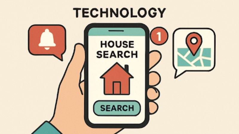
Retrofuturism is a visual language that looks backward to imagine the future. It borrows the optimism of 1950s atomic-age adverts, the sleek curves of mid-century modern design, and the neon-drenched fantasies of 1980s synth culture. The result is a delightful mash-up: chrome, rayguns, rounded type, and optimism mixed with a pinch of ironic decay. But can AI actually recreate that feel in a slide deck? Short answer: yes — with constraints. The trick is to combine AI image and layout tools with human curation, iteration, and a clear design brief. If you’re short on time, an AI presentation maker to save time can generate base slides quickly—but you’ll still want to steer tone, color, and typography to get a truly retrofuturistic vibe.
Below, I’ll explain what makes retrofuturism tick, how modern AI models reproduce—or miss—those cues, and provide actionable workflows, prompts, and templates so that your next deck reads like a time-travel postcard.
What is retro-futurism in slides?
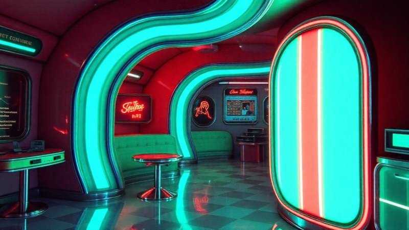
Retrofuturism isn’t a single “look”-it’s a set of visual signals that, when combined, trigger nostalgia for past futures: Shapes and silhouettes: Rounded corners, porthole windows, sweeping curves, fins and aerodynamic forms evoke the 1940s–60s. Later variants add gridlines and neon tubing from the 1980s.
Color palettes: Pastel rocket-era hues (teal, mustard, salmon) and high-contrast neon (magenta, cyan, electric blue) both appear, depending on the era you’re channeling.
Materials and texture: Chrome, brushed metal, halftone printing dots, grain, and scan-lines for the simulation of CRTs.
Typography: Geometric sans-serifs (think Futura-style) or quirky display fonts with thick strokes and rounded terminals.
Imagery: Illustrations of gadgets, stylized cityscapes, retro robots, and schematic diagrams that suggest optimistic technology.
Mood: A mix of earnest futurism—optimistic tech—and playful irony—what the past thought the future would be.
How AI models reproduce retro cues: strengths and limits
Modern image models are diffusion models and large multimodal systems that very capably reproduce surface-level cues-color, texture, and literal motifs such as “retro robot” or “mid-century living room.” They can convincingly provide illustrations and backgrounds; they are fast in exploring variations.
However, AI fails at deeper stylistic coherence across many slides and with typographic subtlety. Fonts, kerning, and readable typesetting usually need manual fixes—many image models don’t even produce decent-looking letter shapes. AI also sometimes creates era mismatches (e.g., 1950s chrome with 1980s neon in a way that feels incongruous).
That means the best results come from a hybrid approach—use AI to generate assets, then refine in a slide editor.
Practical workflow: From prompt to polished deck
Start with making a moodboard. Gather 8–12 reference images from magazines, posters, and concept art. This trains your eye and helps generate consistent prompts.
Define the era and palette. Choose one retro-futurism substyle (e.g., Atomic Age: pastels + chrome, Synthwave: neon + gridlines). Lock the palette because you are going to use it across slides.
Generate key visuals using AI with targeted prompts: this would include hero images, backgrounds, icons, textures. An example prompt would be
Mid-century retrofuturist cityscape; pastel teal and mustard palette; chrome accents; soft halftone texture; 3:2 aspect ratio; stylized illustration.
Export layers and masks. If your tool supports transparent backgrounds, export objects – robots, rockets – separately so you can layer them over slide backgrounds.
Assemble in your slide editor. Use a master slide template applying the chosen palette, header font and spacing rules. Replace autogenerated text with real content; avoid placing text over busy areas.
Fix typography manually. Pick web-safe or embedded fonts that fit in your era – geometric sans for mid-century, neon display for synth. Adjust tracking/line height for readability.
Add finishing textures and motion. Subtle grain, halftone overlays, vignette or a low-opacity scan-line layer can help in unifying slides. In presentations, simple slide transitions-often wipe, dissolve-fit the retro mood better than flashy 3D transforms.
Example prompts and variations
Hero Image – Atomic Age: “1950s advertising style rocket launch, optimistic tone, pastel teal and coral, halftone screen print texture, vector-illustration style, high detail.”
Icon set: “Flat icons of retro gadgets: radio, tape recorder, robot — simplified shapes, two-color palette, rounded corners.”
Background Texture: “Subtle paper grain w/ light crease marks and halftone dots, warm off-white base.”
When doing variations of prompts, only change one variable at a time: color, texture, or era. This way, you will more easily converge to the result you want.
Accessibility, licensing and practical concerns
Legibility: Retro-futurism visuals are often busy. Always test the contrast ratio and make sure you can read the slides from a distance. Large, high-contrast body text is accessible.
Licensing: If you create images with third-party AI tools, make sure to check the licensing of the tool for commercial use. When using generated elements from public models, favor unique combinations and avoid the direct copying of copyrighted posters.
File Size: High-resolution textures look great, but they can bloat slides. Use optimized PNGs/webp and compress where possible.
Templates and time-saving tips
Master slides: Construct 3 master layouts: Title, Content (text + image), and Full-bleed visual. Apply global color tokens so that updating one value updates the entire deck.
Asset library: Have a folder with AI-generated icons, masks, and textures, organized by era and palette. Reuse in other projects for consistency.
Iterative prompts: Use quick A/B generations for hero images; pick the top two and mix elements manually in an editor for the strongest result.
Automate repetitive changes: If your slide tool supports themes or CSS-like styles, script color swaps or font replacements to rapidly transform an existing deck into a retrofuturist version.
When to use pure AI, and when to edit manually
Use AI to:Create concept art and mood images.
Create iconography and decorative elements.
Explore multiple stylistic directions quickly.
Edit manually to:
Fix typography and layout for readability.
Ensure brand alignment-logos, color correctness.
Fine tune com-position and alignment across slides.
Final checklist for retrofuturist slide decks
Choose only one retro era and then lock the palette.
Create a moodboard and collect references.
Generate hero images, icons, and textures with targeted prompts.
Assemble in slide master templates. Fix typography.
Apply grain/scan-line overlays for cohesion.
Test readability and export optimized assets. Check licensing and accessibility compliance. Conclusion AI is a great creative collaborator for retrofuturism slides: fantastic for ideation, speedy asset creation, and iterating with you. But when it comes to actually attaining authentic, transporting nostalgia, human taste needs to come into play: choosing the right era, curating palettes, and making the typography and accessibility decisions that AI tends to get wrong. Take a hybrid approach, coupling AI generation with human refinement; keep a tight moodboard; and scale your look across the deck using master slides. If you do it that way, your slides won’t just look like a past vision of the future-they’ll feel lovingly designed and ready to transport your audience through time.