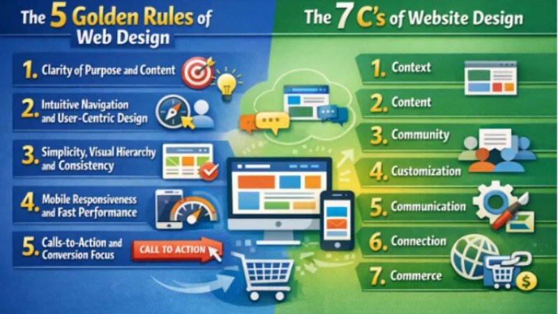
The 5 Golden Rules of Web Design
Effective web design starts with a clear purpose and a focus on real users. Studies show that first impressions are overwhelmingly design-driven – in fact, one analysis found that 94% of first impressions are based on a site’s visual design. Users form opinions in mere fractions of a second (about 0.5 seconds on average). If a visitor arrives and can’t tell what your site does, they’re gone. With that in mind, designers follow a set of “golden rules” that ensure a site looks great and works well for visitors. Following these principles leads to higher engagement and conversion – for example, fast-loading pages have conversion rates 5× higher than slow ones, and conversely, each extra second of load time cuts conversion by ~4.4%. Below, we explore five key rules, grounded in UX/UI best practices and backed by research, that help any website deliver an excellent experience and drive results.
1. Clarity of Purpose and Content
The foremost rule is clarity: your site must immediately communicate what you offer. Every page should answer a simple question: “What is this site, and why should I care?”. A clear headline, simple language, and straightforward layout help users grasp your value quickly. For example, make sure visitors can identify your business (or site topic) in the first 3–5 seconds; otherwise studies show they will “bounce” off to a competitor. Clear headings and visuals also guide the eye – use concise, readable text and prominent calls-to-action (CTAs) that spell out what to do next (e.g. “Get a Quote,” “Shop Now,” or “Learn More”). According to a user-interface guideline, “a good interface eliminates ambiguity and allows users to interact without second-guessing”. In short, don’t be clever at the expense of clear messaging. Good content matters: 60% of consumers will abandon a purchase if the user experience is poor, often due to unclear information or broken functionality. High-quality, useful content – from compelling product descriptions to informative blog posts – positions your business as the solution to users’ needs, helping convert visitors into customers.
2. Intuitive Navigation and User-Centric Design
Even the best content won’t help if visitors can’t find it. The second golden rule is to design for the user, not the designer. This means your site’s navigation should be simple, logical, and consistent on every page. Clear menu labels, a straightforward menu hierarchy, and easily accessible search or sitemap tools ensure users find what they want in seconds. For instance, if someone lands on your site and can’t figure out how to find pricing or contact information quickly, research shows they will simply leave and go elsewhere. A well-structured layout also anticipates user goals: think about common tasks (like checking out or booking an appointment) and make them one-click away.
Good navigation isn’t just menus, though – it’s a mindset. Empathy and testing are key: observe how real users browse your site. In practice, this often means using a clear, visible menu bar at the top of the page, organizing pages under intuitive sections (e.g. “Products,” “Services,” “About Us,” “Contact”), and ensuring links look clickable. Also prioritize the left side of the page: eye-tracking studies find about 80% of users spend most of their time on the left half of a page, so put important links and text on the left. Clear breadcrumbs, consistent “back” links, and prominent contact info further reduce confusion. In essence, rule #2 is usability first: make the site feel familiar and predictable so users stay engaged rather than click away.
3. Simplicity, Visual Hierarchy and Consistency
Keep it simple. Rule #3 is the “KISS” principle – Keep It Simple, Stupid. Remove any unnecessary clutter or flashy gimmicks. Every design element should serve a purpose. Overloading pages with too many images, animations, or choices actually hurts conversions. For example, cluttered pages can cause conversion rates to drop by up to 95%. Even having too many form fields or complex checkout steps makes 81% of people abandon a form. Instead, use white space strategically: it lets important elements (your headline, product image, signup form, CTA buttons) stand out. This visual hierarchy guides the eye to the most important things first.
Alongside simplicity, maintain a consistent look and feel throughout the site. Rule #4 is consistency: use the same color palette, typography, button styles, and layout grid on every page. Consistency builds trust – when everything looks uniform, visitors trust your brand more, because predictability reduces cognitive load. In fact, 48% of users say website design is the most important factor in a company’s credibility. If your homepage looks like one style and your product pages look like another, users will hesitate. To implement this, companies often create a simple style guide or component library so every new page follows the same rules. In practice, this means using identical navigation bars, button colors, and font sizes across the site. When a visitor moves from your homepage to an inner page, nothing should feel “off” or different.
4. Mobile Responsiveness and Fast Performance
By mid-2025, over 60% of global web traffic comes from mobile devices, and that share keeps growing. Rule #4 acknowledges this reality: your site must perform well on phones, tablets, and desktop alike. Responsive design isn’t optional – it’s fundamental. A mobile-friendly site adapts its layout and images to fit any screen size, and ensures buttons, forms, and navigation are easy to tap. Google even gives mobile-optimized sites a ranking boost, and users expect flawless mobile experiences (83% say consistency across devices is very important). In short, design every page to look polished and work smoothly on small screens.
Speed matters too. Users are impatient: nearly half expect pages to load in 2 seconds or less. In practice, fast-loading sites keep users, while slow ones lose them. In B2B studies, a 1-second load time had 5× higher conversion than a 10-second load. And every extra second drops conversion by ~4.4%. To meet this rule, compress images, use efficient code, and choose good hosting or a CDN. Also consider “lazy loading” content and minimizing heavy third-party scripts. Mobile pages should aim for even faster loads, since mobile bounce rates are typically ~60% (versus ~50% on desktop). Overall, rule #4 says: optimize for speed and mobile so users get the info they need instantly on any device.
5. Calls-to-Action and Conversion Focus
Every page on your site should drive a clear action – buying a product, requesting a quote, signing up for a newsletter, etc. That’s rule #5: explicitly guide users toward conversion with obvious calls-to-action (CTAs) and user-friendly interactions. Design CTAs (buttons or links) that stand out in color and wording (e.g. “Subscribe Now” vs. just “Submit”), and place them where users naturally look, such as at the top of the page or after key information. Remember that almost 70% of small business sites lack any CTA on their homepage; don’t make that mistake.
Conversion focus also means removing friction from the user journey. Simplify forms to the fewest fields needed, provide helpful error messages if someone fills incorrectly, and reassure with trust signals (like security badges or customer testimonials) near CTAs. Modern UX research underscores this: improving interface design can boost conversions by hundreds of percent – one study found better UI yields 200% more conversions, and superior UX around 400% more. In practice, that means pairing clear, prominent CTAs with persuasive content. For example, a product page might highlight a “Buy Now” button next to a short list of benefits. After checkout, show a friendly “Thank You” page or progress indicator. The idea is to remove doubt and lead users step-by-step.
By following these five rules – clarity, user-focused navigation, simplicity/consistency, mobile/speed optimization, and strong conversion paths – designers create sites that not only look professional but also deliver real business results. Statistics bear this out: visitors expect good design and fast performance, and sites that meet these needs enjoy higher engagement, trust, and sales.
The 7 C’s of Website Design
A complementary framework to the above rules is the 7 C’s of Web Design, a model introduced by Rayport and Jaworski. These seven principles cover every aspect of a website’s structure and strategy. In modern discussions they’re often expanded with extra “C’s” (for example Credibility or Consistency), but the core 7 remain a useful checklist. The diagram below illustrates the original 7 C’s (Context, Content, Community, Customization, Communication, Connection, Commerce) along with three newer additions:
- Context: The site’s layout and design.
- Content: Text, pictures, sound, and video that the site contains.
- Community: The ways that the site enables user-to-user communication.
- Customization: The site’s ability to tailor itself to different users or allow users to personalize the site.
- Communication: The ways the site enables site-to-user, user-to-site, or two-way communication.
- Connection: The degree to which the site is linked to other sites.
- Commerce: The site’s capabilities to enable commercial transactions.
Context
Definition: Context is about the overall environment and purpose of the website. It means knowing exactly who your audience is, what they need, and why they are visiting. A site for the general public should look different than an internal corporate portal, for example. Context covers the layout and visual style: is this a playful site for kids or a professional site for executives? It also considers practical factors like device or situation – are users on the go or at a desk? Context influences everything from color scheme to navigation order.
In practice: Start by researching your users and goals. If you run a pet supply store site, your context might be pet owners looking for products and advice. You’d then design a clean, colorful layout with easy category filters (e.g. “Dogs,” “Cats,” “Care Tips”) that matches their expectations. Testing with real users early on ensures the context is right – for example, user interviews might reveal that seniors need larger fonts, so you build that into your design. A user-centered approach (observing how people will actually use the site) keeps the design aligned with audience habits. In short, Context makes sure your site’s look and feel match its purpose.
Content
Definition: Content is the heart of the site – all the text, images, videos, and other media that convey your message and value. It shapes both appearance and function: great content attracts visitors and keeps them engaged, while sparse or unhelpful content drives them away. This includes blog posts, product descriptions, images, infographics, videos, and even downloadable resources. Content must be valuable, relevant, and well-organized.
Why it matters: The right content strategy boosts both UX and SEO. Content is the heartbeat of any website, driving engagement and providing value. Original, informative content tells users why they should stay. For example, using unique product photos and explainer videos not only grabs attention but has been shown to significantly increase engagement – one source found that original graphics can boost engagement by ~20%, and embedded videos/images can raise interaction rates by up to ~80%. Well-written copy and helpful visuals also signal credibility and expertise.
Implementation: Organize content under clear menus, and keep it up-to-date. On a news or blog site, write articles that address your audience’s questions. On a business site, highlight FAQs, case studies, or testimonials to answer visitors’ needs. Use images and videos judiciously to illustrate points (e.g. product demos or tutorial videos). Ensure text is concise: break it into short paragraphs with headings for scannability. Finally, optimize content for search engines (SEO) by using relevant keywords in headings and metadata – this helps more users find your site. In sum, Content should directly address user interests and brand goals, since high-quality content greatly improves user engagement and trust.
Community
Definition: Community refers to the ways a website brings people together and encourages interaction – for example through forums, blog comments, user reviews, or social media integration. It’s about building a sense of belonging and enabling users to communicate with each other and with your brand.
Why it matters: An active community keeps users on your site longer and fosters loyalty. People trust recommendations from others and feel connected to a brand that listens. According to industry research, 85% of brand owners say a branded online community increases audience trust. This makes sense: a forum or comment section where users share experiences creates valuable user-generated content and social proof. Moreover, engaged communities can produce ideas and feedback that help you improve your offerings.
Implementation: To cultivate community, integrate social features. For example, allow comments under articles, include a Q&A forum on technical topics, or share links to your Facebook or Twitter. Encourage participation with incentives (like “Top Contributor” badges). Highlight user content such as testimonials or photos from customers. Maintain active moderation and respond to user feedback to keep the community healthy. For instance, a fitness website might host a forum where members share workout tips; this not only boosts engagement but also positions the site as an authority. In practice, incorporating community features leads to a virtuous cycle of increased engagement, return visits, and trust.
Customization
Definition: Customization (or personalization) is the ability for users to tailor certain aspects of the site to their preferences. This could be as simple as adjusting text size or switching to a dark theme, or as advanced as changing a dashboard layout or selecting preferred language.
Why it matters: Letting users customize their experience makes them feel more comfortable and in control. Research notes that 54% of users prefer content tailored to their interests, which can dramatically increase engagement. For example, a news site might let users select topics they care about, so the homepage highlights those articles. An e-commerce site could remember a user’s preferred currency or product category. Even small touches like remembering a user’s name or login state contribute to a sense of personalization and relevance.
Implementation: Build in basic customization options. Common features include changing font size or contrast (for accessibility) and saving user preferences. More advanced personalization might use AI: for example, recommend products or articles based on past behavior. For authenticated users, allow profile settings (e.g. language, region). Always ask users for permission for complex personalization (like tracking viewing habits). The key is to make adjustments straightforward: visible “settings” icons or switches. Customization also ties back to consistency and branding – whatever options you offer, ensure they fit the overall design. When done well, customization makes the site feel designed for me, which keeps users coming back.
Communication
Definition: Communication is about how your site shares information and interacts with users. This includes clear instructions, prompts, alerts, and feedback mechanisms. Essentially, it’s everything that facilitates user interaction beyond static content.
Why it matters: Clear communication removes confusion. Imagine a website where clicking a button yields no visible response – users will wonder if anything happened. Good communication might include confirmations (“Your order has been placed!”), error messages (“This field is required”), or progress indicators. It also covers concise navigation labels and CTAs that we discussed in the golden rules. As one guide puts it: use clear and concise navigation menus, calls to action, and interactive feedback to guide users.
Implementation: Ensure every interactive element gives feedback. For example, when a form is submitted, show a “Thank you” message. If a page is loading, display a spinner. Color-change buttons on hover and clickable animations can signal functionality. Provide friendly, actionable error messages (instead of “Invalid input”, say “Please enter a valid email address”). Use tooltips or brief instructions for complex features. Also, structure your navigation labels as plain language (e.g. “Start Free Trial” instead of “Click Here”). In short, think through the user’s experience at each step and make the interface talk back – this builds confidence. Clear communication ultimately keeps users engaged and reduces frustration.
Connection
Definition: Connection refers to linking your website with other platforms and technologies. This includes social media integration (share buttons, social feeds), backlinks to and from other sites, embedded content (like YouTube videos or maps), and connections to analytics or third-party services.
Why it matters: In the modern web, no site is an island. Connection enhances functionality and visibility. For example, by linking your content to social networks, you make it easy for users to share it, driving more traffic. Embedding a video from a reputable source or linking to authoritative references can make your content richer. Backlinks (links from other reputable sites) not only boost SEO but also signal trustworthiness. Essentially, connections tie your site into the larger web ecosystem and can improve user experience by providing more resources.
Implementation: Include social media share icons on articles and products so users can quickly post them on Facebook, Twitter, etc. Embed relevant third-party content judiciously (e.g. a live map of your location or an explanatory video). Whenever you reference another site’s information, consider adding a link back for credibility. Also integrate analytics tools (like Google Analytics) to gather data – knowing how users arrive and move through your site is a key “connection” that drives future improvements. Finally, consider services that enhance UX: for instance, connecting a chat support widget or allowing Google/Facebook logins. Thoughtful connections make the site more powerful and user-friendly.
Commerce
Definition: Commerce covers any transactional functionality on your website – basically, the features that enable buying, selling, or other exchanges of value. It’s the virtual shop and checkout process of an e-commerce site, or more generally any means for visitors to take a valuable action (booking an appointment, submitting an order form, etc.).
Why it matters: For commercial and organizational websites, smooth transactions are crucial. If users can’t easily pay, register, or submit requests, you lose sales or leads. Commerce features include product catalogs, shopping cart, pricing displays, payment gateways, account registration, and order tracking. They must be secure and transparent to build trust (for example, clearly showing SSL security badges during checkout). Statistics underline this: adding a checkout coupon lifted conversion by 48% in one study, and breaking up forms into steps reduced abandonment by 20%.
Implementation: Ensure your shopping cart or form funnel is straightforward. For e-commerce, display products with clear pricing and an obvious “Add to Cart” button. The checkout process should be as few clicks/pages as possible, and allow guest checkouts or social logins for convenience. Provide multiple payment options (credit card, PayPal, etc.) and reassure users with trust signals (like “PCI-compliant payment” icons). For lead-gen sites, include well-designed inquiry forms. Also handle post-purchase gracefully: show a confirmation page or email immediately. In short, make buying or signing up easy and trustworthy. Commerce features (checkout, payment security, confirmation) are a must-have to turn visitors into paying customers.
Conclusion Of Golden Rules
Web design is much more than just “making things look pretty.” It’s about crafting an experience that users love and that achieves your goals. The 5 Golden Rules (Clarity, User Focus, Simplicity, Consistency/Mobile Optimization, and Conversion Focus) along with the 7 C’s (Context, Content, Community, Customization, Communication, Connection, Commerce) provide a comprehensive blueprint. Together, they cover usability, visual appeal, marketing effectiveness, technical performance, and credibility. In practice, following these principles is critical: users form an opinion in only half a second, and pages that load faster and guide actions consistently see dramatically higher conversions. By applying these time-tested rules, designers ensure modern websites not only look professional but also engage visitors, build trust, and drive real business results. The result is a site that works for people and for the bottom line – an outcome every designer and business strives for.visit my website for more information